Leveraging Color Theory in Brand Design
21 June 2025
When it comes to brand design, color isn’t just about looking good—it’s about feeling right. Ever wondered why certain brands stick in your memory while others fade away? A lot of that has to do with color psychology. The hues a brand chooses can influence emotions, create trust, and even drive purchasing decisions.
So, how can you leverage color theory to build a strong, unforgettable brand? Let’s dive into the world of colors and how they impact branding.
The Science Behind Color Theory
Color theory isn’t just an art concept—it’s backed by psychology and science. Colors evoke emotions, and those emotions can shape consumer perceptions. In branding, the goal is to create a visual identity that resonates with your target audience.There are three main components of color theory:
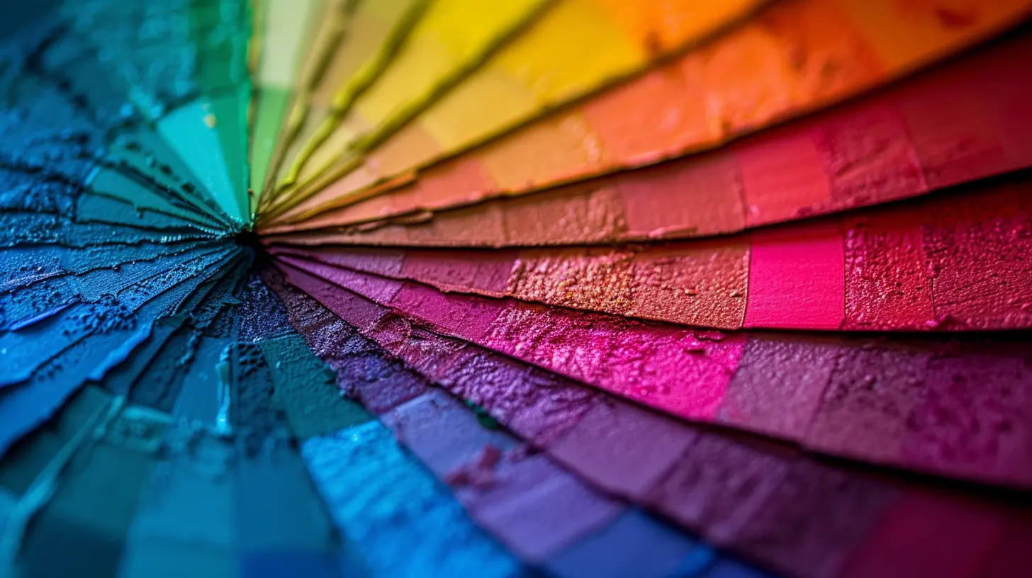
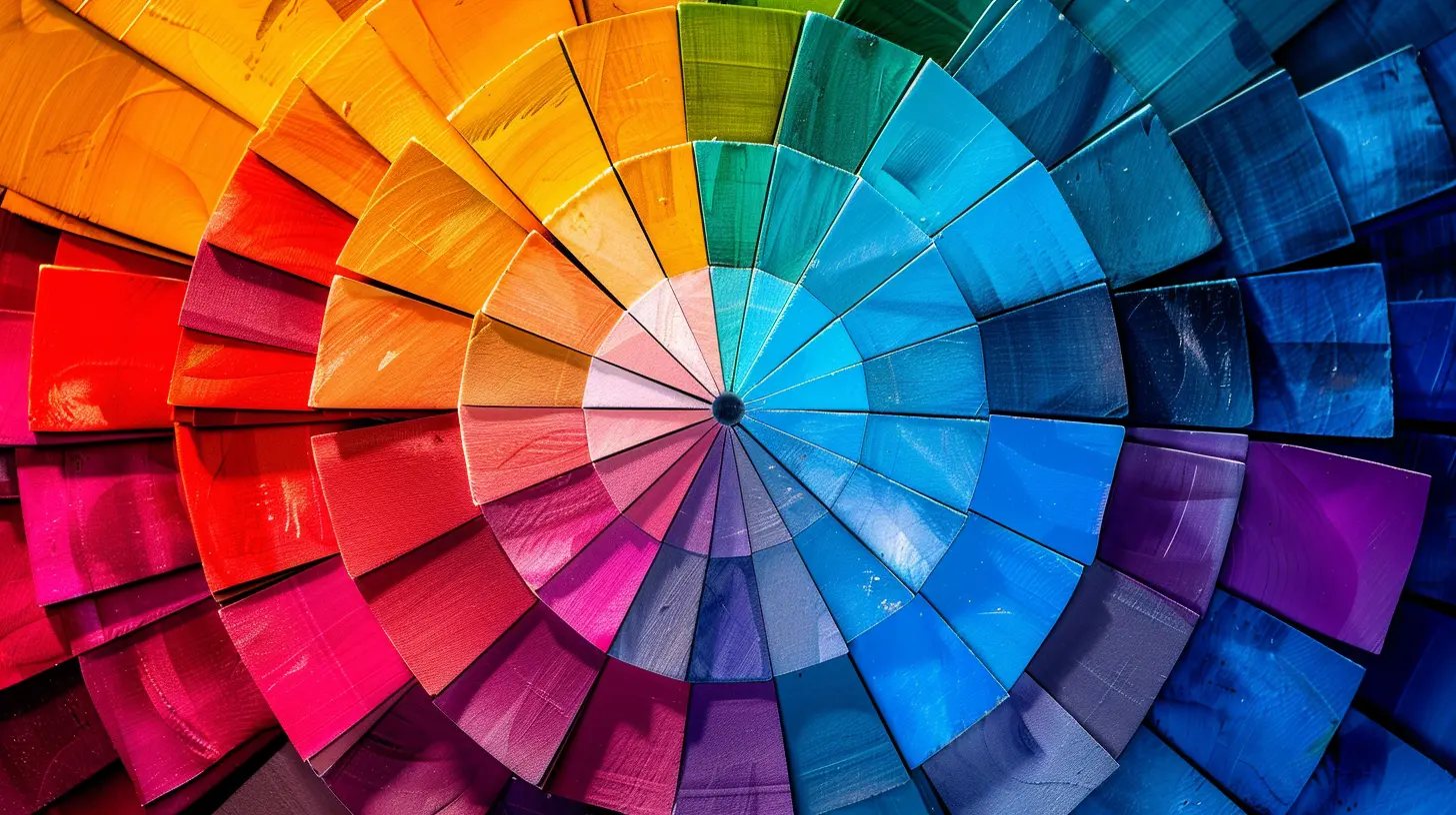
1. The Color Wheel – A structured way of organizing colors based on primary, secondary, and tertiary hues.
2. Color Harmony – How different colors work together to create aesthetically pleasing designs.
3. Color Psychology – The emotional and psychological impact colors have on the human brain.
When you understand these elements, you can create a brand that not only looks appealing but also connects with your audience on a deeper level.
How Colors Affect Emotions and Perception
Color psychology plays a massive role in how people perceive brands. Different colors trigger different emotions, and understanding this can help you craft the right brand message.Red: Passion, Energy, and Urgency
Red is bold, powerful, and attention-grabbing. It’s often associated with excitement, passion, and urgency. That’s why fast-food chains like McDonald's and Coca-Cola use red—it stimulates appetite and creates a sense of urgency.Best for: Brands that want to evoke excitement, passion, or urgency (e.g., food, retail, entertainment).
Blue: Trust, Reliability, and Stability
Ever noticed that banks and tech companies often use blue? That’s because blue signifies trust, security, and professionalism. It creates a calming effect, making it a great choice for businesses that want to convey reliability.Best for: Financial institutions, healthcare, and tech companies (e.g., Facebook, IBM, PayPal).
Yellow: Optimism, Warmth, and Attention
Yellow is cheerful and youthful. It exudes positivity and energy. Brands like McDonald’s and IKEA incorporate yellow to create a welcoming and friendly vibe. However, too much yellow can be overwhelming, so it’s best used sparingly.Best for: Brands looking to appear friendly, energetic, and optimistic (e.g., food, toys, lifestyle).
Green: Growth, Health, and Sustainability
Green is synonymous with nature, health, and sustainability. That’s why eco-friendly brands and health-related businesses often use green. It symbolizes balance and harmony, making it a great fit for wellness and organic brands.Best for: Environmental, health, and wellness brands (e.g., Whole Foods, Starbucks, Animal Planet).
Black: Luxury, Power, and Sophistication
Black speaks of elegance and exclusivity. Luxury brands like Chanel and Rolex use black to create a sense of prestige. It’s sleek, modern, and timeless. However, excessive use of black can sometimes feel unapproachable, so pairing it with other colors is key.Best for: High-end, luxury, or modern brands (e.g., fashion, automotive, tech).
Purple: Creativity, Royalty, and Wisdom
Purple is often linked to sophistication, creativity, and even spirituality. Many beauty and wellness brands use purple to evoke a sense of elegance and mystery. It’s also associated with innovation and imagination.Best for: Beauty, wellness, and creative industries (e.g., Cadbury, Hallmark, Yahoo).
Orange: Energy, Playfulness, and Creativity
Orange combines the enthusiasm of red and the cheerfulness of yellow. It’s energetic and fun, making it popular for brands that want to appear lively and approachable. Companies like Nickelodeon and Fanta use orange to attract a youthful audience.Best for: Entertainment, food, and sports brands (e.g., Fanta, Harley-Davidson, Amazon).
White: Simplicity, Purity, and Minimalism
White represents cleanliness, simplicity, and purity. Brands that emphasize a minimalist approach or clarity in their messaging often use white as their primary color. Think Apple—its clean, white aesthetic enhances its modern and sleek identity.Best for: Health, tech, and minimalist brands (e.g., Apple, Nike, Tesla).

Choosing the Right Colors for Your Brand
Now that you understand how colors influence perception, how do you choose the right one for your brand? Here are some practical tips:1. Understand Your Brand Personality
Ask yourself—what emotions do you want your brand to evoke? Is it bold and energetic, or calming and trustworthy? Your brand’s personality should align with your color choices.2. Know Your Target Audience
Different cultures and demographics perceive colors differently. For instance, while white symbolizes purity in Western cultures, it is associated with mourning in some Asian cultures. Research your audience’s perception of color before making a decision.3. Consider Your Industry and Competitors
Take a look at what your competitors are doing. While you don’t want to copy them, understanding industry norms can help you make strategic choices. For example, blue is widely used in finance, while green is common in health and wellness.4. Use Color Combinations Wisely
Your brand isn’t limited to just one color. Using a well-thought-out color palette can enhance your brand’s identity. Some popular combinations include:- Analogous Colors (colors next to each other on the wheel) – Create a harmonious look.
- Complementary Colors (opposite colors on the wheel) – High contrast and eye-catching.
- Monochromatic Colors (shades of the same color) – Sleek and modern aesthetic.
5. Test and Iterate
Colors can look different depending on the medium—what works on a website might not look the same in print. Try A/B testing different color schemes to see how your audience responds.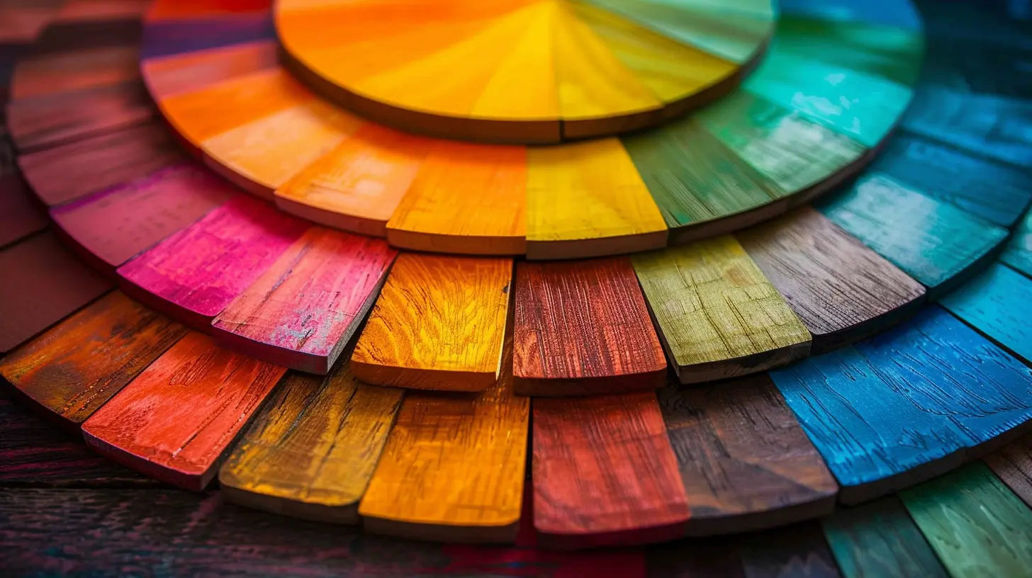
The Impact of Color on Branding
A well-thought-out color scheme can:✔ Increase brand recognition by up to 80%.
✔ Influence consumer purchasing decisions.
✔ Create an emotional connection with the audience.
Think about brands like Coca-Cola, Facebook, and Apple. Their colors have become synonymous with their identity, making them instantly recognizable. When you leverage color theory correctly, you’re not just making your brand look good—you’re making it memorable.
Final Thoughts
Choosing the right color for your brand isn’t just an aesthetic decision—it’s a strategic one. Colors influence how people feel, think, and behave. By understanding color psychology, aligning it with your brand personality, and considering your target audience, you can create a brand that truly stands out.So, next time you pick a color for your branding, ask yourself—what story does this color tell? Make sure it’s the right one!
all images in this post were generated using AI tools
Category:
BrandingAuthor:

Miley Velez
Discussion
rate this article
2 comments
Yasmeen McFee
Colors speak louder than words; let your brand's personality paint the town!
October 21, 2025 at 2:26 AM
Miley Velez
Absolutely! Colors are a powerful tool in brand design, conveying emotions and messages that words often can't. Let's harness that power to create impactful brand identities!
Zayden Patel
Great insights! Color truly shapes brand perception and connection.
June 21, 2025 at 10:25 AM
Miley Velez
Thank you! I'm glad you found the insights valuable. Color really does play a crucial role in shaping how consumers perceive brands.